Quick answer
Review an enquiry form by completing it with only the keyboard. Check that every field has a visible label, controls can be reached in a sensible order, error messages say which field and what to fix, and confirmations are noticeable. Record each issue with an owner, and do not claim formal compliance from one check.
- Placeholder text is not a label, and you should always be able to see where keyboard focus is.
- Submit the form with mistakes and check errors appear where users will find them and are connected to the field.
- Record page, steps, what happened and what was expected, and state what you tested and what you did not.
A keyboard user can hit a form error that is hard to find or understand. This article shows how to review labels, keyboard use, errors and confirmations and record practical evidence. It does not claim formal compliance. It is written for service business website coordinators and ends with the decision, owner and next step to record.
An illustrative scenario
This is a hypothetical example, not a Web Design Davao client case.
Situation. A customer using a keyboard encounters a form error that is hard to find or understand.
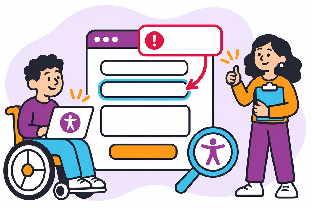
What happens. A tester fills in the enquiry form using only the keyboard. The email field has no visible label, an error appears at the top of the page but focus does not move to it and the confirmation does not receive focus. She records each with the page, the steps and the owner, and does not claim the form passes or fails any standard.
Labels and keyboard use
Check that every field has a visible label and that all controls can be reached and used with the keyboard in a sensible order. Use the field, label and keyboard result fields. Placeholder text is not a label. Watch for focus: you should always be able to see where you are.
Errors and confirmation
Submit the form with mistakes and check the error messages. Use the error message and confirmation result fields. Messages should say which field and what to fix, appear where the user will find them and be connected to the field. After a successful submission the confirmation should be noticeable to a keyboard or screen reader user.
Practical review evidence
Record each issue with the page, steps, what happened and what was expected, and assign an owner. Use the issue owner field. This is a practical review, not an audit. Say what you tested and what you did not, and do not claim the form is accessible or compliant from one check.
Form accessibility test sheet
Use this at the point described above. The workflow owner completes it and a named reviewer checks it. A completed row shows that the information, owner and next step are recorded; it does not prove the outcome. Keep it somewhere the team can edit, and keep it free of passwords, tokens and real client records.
Blank copy
| Field | Label | Keyboard result | Error message | Confirmation result | Issue owner |
|---|---|---|---|---|---|
Illustrative completed row (hypothetical)
| Field | Label | Keyboard result | Error message | Confirmation result | Issue owner |
|---|---|---|---|---|---|
| Visible label | Reachable by Tab | ‘Enter a valid email’ | Message shown, not announced | Developer |
Working through the completed row
The example tests the email field: it has a visible label, can be reached by the Tab key, shows ‘Enter a valid email’, but the message is shown and not announced. The developer owns the fix.
Common mistakes
- Treating placeholder text as a label.
- Claiming compliance from one test.
- Not saying what was not tested.
Questions to settle before you rely on it
- Does every field have a visible label?
- Can the form be completed by keyboard?
- Are errors announced clearly?
How you know it is complete
The sheet is complete when each field has a label result, keyboard result, error result, confirmation result and issue owner. Record who reviewed it and the date.
Where you may not have the answer
You cannot test with assistive technology. Say so in the record and note what you could check. The handoff, not a guess, is the correct next step.
Your next action
Test your main form with only the keyboard.
Ask Web Design Davao to review this workflow and scope the website or marketing support required. Website maintenance & security arrangements are agreed individually; nothing here assumes a particular service, role or timing is already available.
How Web Design Davao works
- Enquiries are generally answered within four hours during support hours (Monday to Friday, business hours), with after-hours help for emergency requests. Scope is agreed individually.
- Preventative website maintenance includes keeping plugins up to date and reviewing website code for known vulnerabilities. This reduces exposure to attack; it does not guarantee a site cannot be compromised. See website updates and uptime monitoring.
Frequently asked questions
How do I test a form with only the keyboard?
Fill in and submit the enquiry form using only the keyboard, noting whether each control can be reached and used in a sensible order and whether you can always see where focus is. Record each problem with the page, steps and what was expected.
What makes a good form error message?
It says which field has the problem and what to fix, appears where the user will find it and is connected to the field. After a successful submission, the confirmation should be noticeable to a keyboard or screen reader user.
Does passing this review mean my form is accessible?
No. This is a practical review, not an audit. Say what you tested and what you did not, and do not claim the form is accessible or compliant from one check. If you cannot test with assistive technology, note that in the record.