Quick answer
Make website forms accessible by giving every field a visible label that stays visible when typing, explaining errors in text beside the field, keeping typed entries on error, and testing the whole form with a keyboard. Show a clear confirmation after submitting. A placeholder is not a label, and colour alone should not signal an error.
- Connect each label to its field, mark required fields in text and use the right input type for phones.
- Check with Tab, Shift+Tab, Space and Enter that order follows the visual order, focus is visible and nothing traps focus.
- Fix the form template or tool if it produces poor markup, and build the checklist into new form specifications.
A form that people cannot complete loses enquiries and may exclude people with disabilities. Many form problems are small: a missing label, a vague error or a button that a keyboard cannot reach. This guide gives a focused implementation and test workflow for forms. It is not another general accessibility overview. For the basics, see accessibility basics.
Check current W3C guidance when you build. The examples are illustrative.
An annotated form
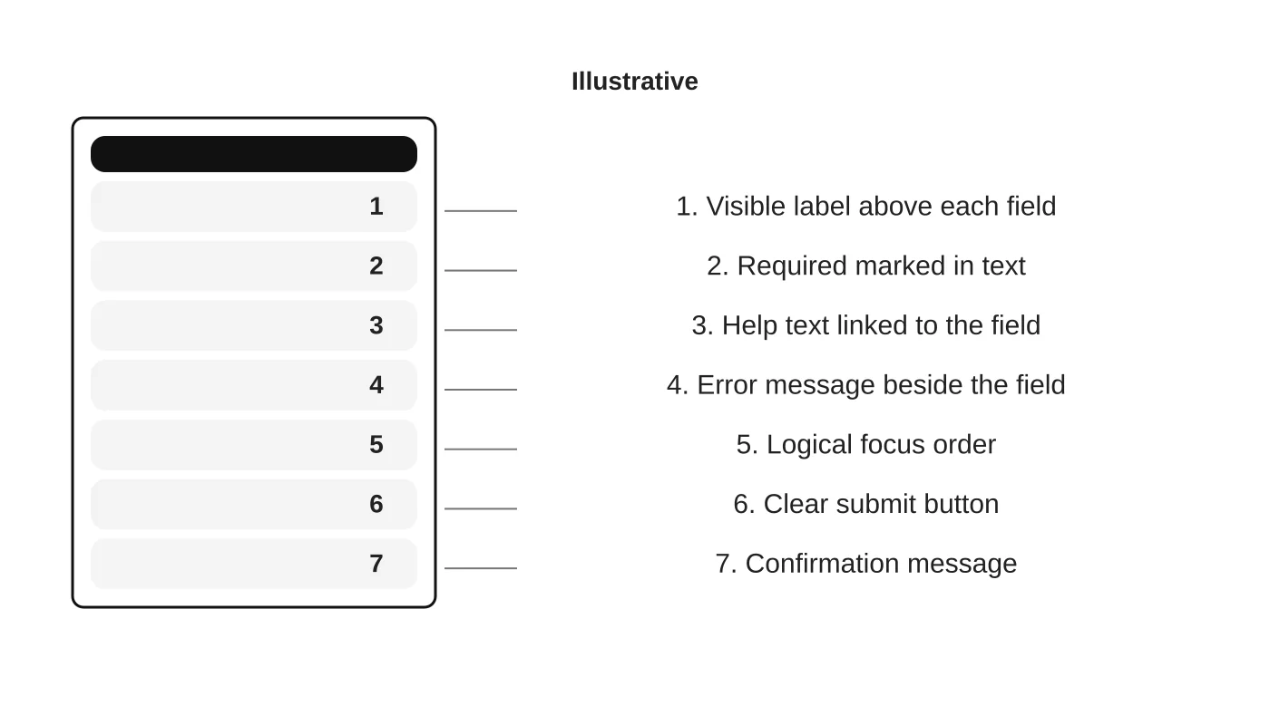
The wireframe shows the pieces covered below.
Label every control
- Give each field a visible label that stays visible when typing. A placeholder is not a label.
- Connect the label to the field so assistive tools announce it.
- Mark required fields in text, not only with colour or an asterisk.
- Group related fields, such as a set of options, with a clear group label.
- Use the right input type so phones show the right keyboard.
Keep wording plain. Ask only what staff need, as in clinic appointment forms.
Explain and recover from errors
- Say what is wrong and how to fix it, next to the field, in text.
- Do not rely on red colour alone.
- Move attention to the first error or an error summary, and keep what the visitor already typed.
- Do not clear the form on error.
- Avoid timeouts that lose entries without warning.
Test the keyboard flow
Put the mouse aside. Press Tab to move through fields and buttons, Shift+Tab to move back, Space or Enter to activate controls. Check that:
- The order follows the visual order.
- The focus indicator is always visible.
- Menus, date pickers and pop-ups can be opened and closed with the keyboard.
- Nothing traps focus.
Verify confirmation states
After submitting, show a clear message in text and make sure assistive tools announce it. Do not rely on a small colour change. Send a confirmation email that says what happens next.
A five-minute test script
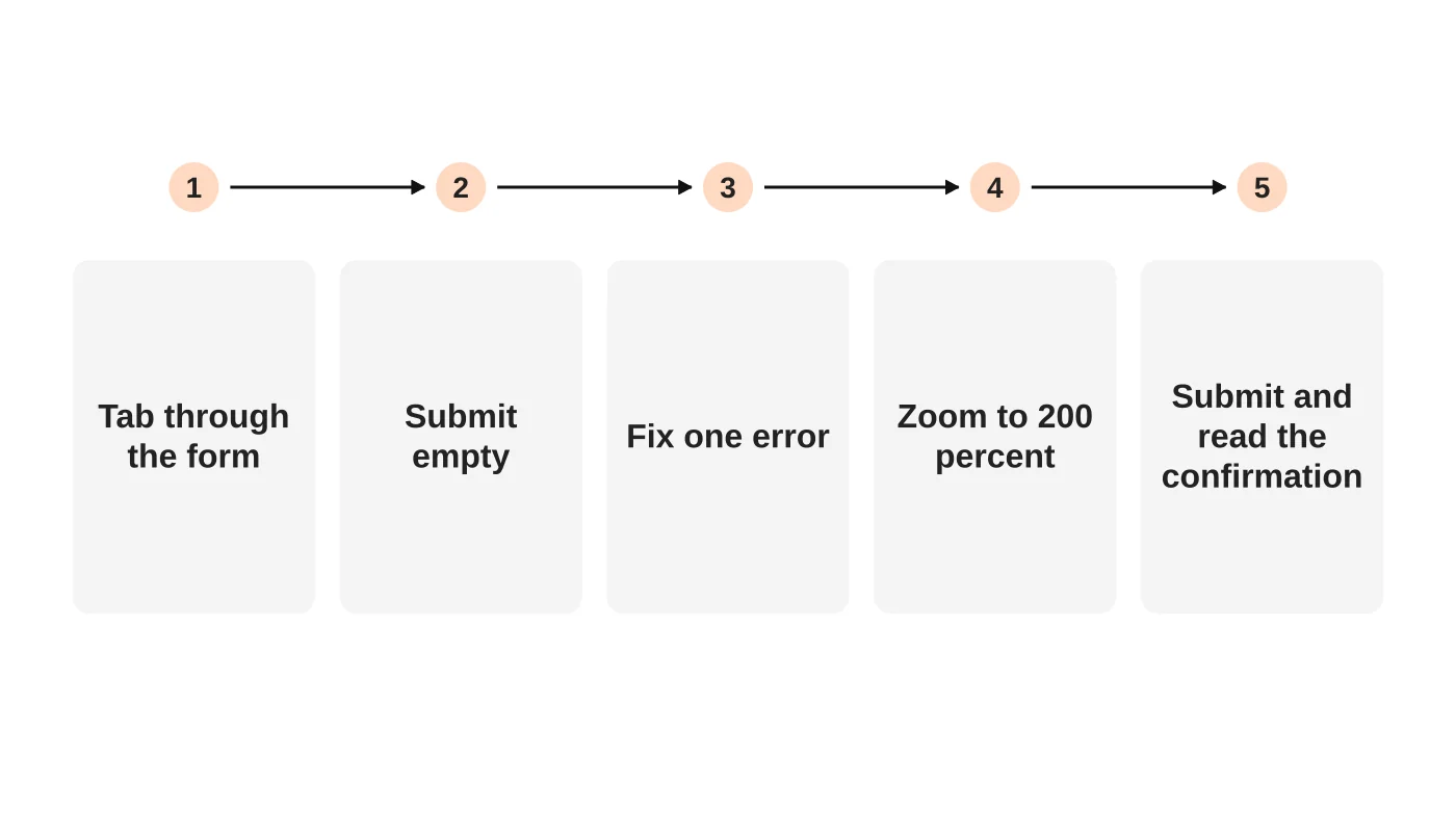
Run it on each form after any change. Add a screen reader check if you can. Record what you find and fix the most serious problems first. Automated checkers help but cannot judge whether labels and errors make sense, so combine them with manual testing.
Fix the root, not each form
If your form tool produces poor markup, fix the template or switch tools. Build the checklist into your form specification so new forms start accessible. For tools that handle bookings, see online booking tools. For how structure drives enquiries, see website structure and leads.
Frequently asked questions
Do I need a CAPTCHA?
Use spam filters first. If you use a CAPTCHA, choose one with accessible alternatives.
Are placeholders enough?
No. They disappear and are often low contrast.
How do I test with assistive technology?
Start with the keyboard, then try a free screen reader on your own forms. Ask users when possible.
Is this a legal requirement?
Requirements depend on your sector and market. Take advice. This is general information, not legal advice. Check your situation with a qualified adviser.
Sources
- Creating helpful, reliable, people-first content, Google Search Central
- Forms tutorial, W3C Web Accessibility Initiative
Review your forms
Web Design Davao’s web design team can review your forms against this test. Get in touch.
Related guide: A Website Accessibility Review for Enquiry Forms and Error Messages