Guests choosing a resort compare. They want to know which room fits their group, what the rate includes, whether it is available and what happens if plans change. A website that makes comparison easy gets more direct enquiries. One that hides details sends guests to booking platforms where details are easier to find.
This checklist is for owners and managers. Fill it with your verified information. It makes no claim about results. For the strategy behind it, see the resort marketing guide.
The room page
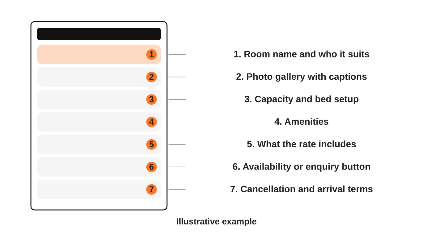
The wireframe is illustrative. For each room type, include:
- Name and who it suits, such as couples, families or groups.
- Photos with captions, showing the real room, bathroom and view. Use recent images.
- Capacity and beds, including extra bed rules and child policy.
- Amenities, limited to what is actually provided.
- What the rate includes, such as breakfast, activities, transfers or fees.
- A clear next step: check availability or send an enquiry.
- Cancellation and arrival terms, or a visible link to them.
Compare rooms at a glance
Add a comparison table on the main accommodation page: room, capacity, size, key features and how to enquire. Guests should not have to open six pages to compare.
Rates and inclusions
- Be transparent. Say what the rate includes and excludes: taxes, service charges, environmental or entrance fees and transfers.
- Show conditions: minimum stays, peak periods and payment terms.
- Date your prices if they change, and remove old ones.
- Do not publish rates you cannot honour.
If you prefer not to show prices, explain what changes them and how to ask. Guests dislike mystery.
Availability or enquiry
Decide what the site does:
- Live availability and booking, through a booking engine. Check that it works on mobile, shows the same rates and sends clear confirmations.
- Enquiry only, through a form or message. State how fast you reply.
Either is fine if it is clear. Mixed signals, such as a “Book now” button that opens a blank form, cause drop-offs. See online booking tools for service businesses.
Photography and mobile speed
Guests judge a resort through photos. Use real, current images that show the whole room. Compress them so pages load quickly on mobile data, and keep captions and alt text. See website speed and accessibility basics.
Test the booking path on a phone
Do this before peak season and after any change to the booking tool. It needs a phone, a notebook and someone who does not work at the resort.
- Set up. Record the phone model, connection (mobile data and Wi-Fi) and browser. Write one task per line, such as “find a room for four people” and “send an enquiry for next month”.
- Load and first screen. Time the first page. Check that you can see what the resort is, where it is and what to do next without scrolling.
- Find and compare. Can the tester compare room types, capacity and inclusions without opening many pages?
- The handoff. Tap “Book now”. Does it open a booking engine, a platform or a form? Do the name, branding and price match? Can the tester go back without losing choices?
- Form and confirmation. Are fields large enough to tap, with the right keyboard for phone numbers? Submit a test enquiry, then check what the team receives and how fast.
- Log and fix. For each problem write what happened, how serious it is and the fix. Repeat after changes.
This is a test you run on your own site, so the results are what you observe. Do not assume a fix will raise bookings; compare enquiries before and after. See website speed for Philippine mobile visitors for the speed side.
Arrival information
Practical details reduce enquiries and worries:
- How to get there, from the airport or city, including boat schedules where relevant.
- Check-in and check-out times.
- Nearby services and what is and is not available on site.
- Contact numbers that someone answers.
Verify this information regularly. Schedules and conditions change.
Terms guests need
State the cancellation and change policy, payment methods, deposit rules, house rules and child and pet policies. Write them in plain language. This is general information, not legal advice. Check your situation with a qualified adviser.
The owner checklist
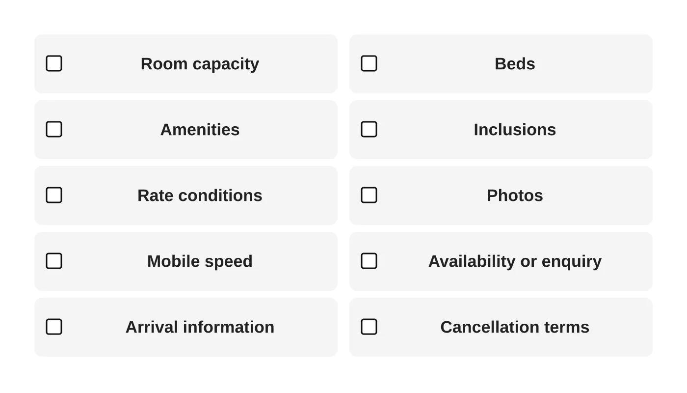
Tick each item for each room type. If any are unticked, fix them before spending on marketing.
Common mistakes
- Out-of-date rates or photos.
- Information only in PDFs or images.
- Different details on each platform.
- A booking path that works on desktop only.
- No answer for “what is included?”
See also direct bookings versus online travel agencies for deciding how your site and platforms work together.
Read next: Direct Bookings vs Online Travel Agencies: A Decision Guide for Resort Owners.
Frequently asked questions
How many photos per room?
Enough to show the room clearly, with real images. There is no ideal number.
Should I list all rates?
If you can, yes, with conditions. If rates change often, show “from” prices only if they are accurate.
Do I need a 360 tour or video?
Not necessarily. Good photos and clear information come first.
Can I link to my booking platform page?
You can, but make your site the place where guests learn what you offer.
Sources
Plan a clearer booking journey
Web Design Davao’s web design team can help plan a clearer booking journey for your resort. Get in touch.