


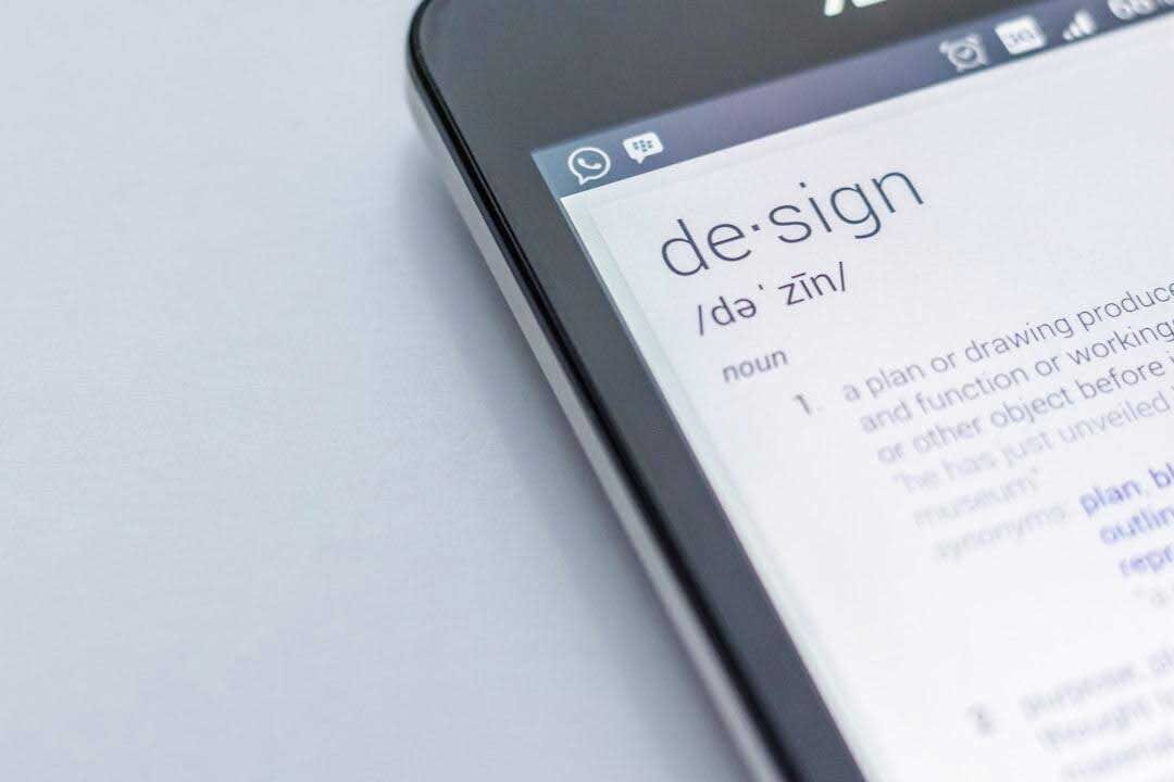
Web Design Davao: Your Trusted Website Design Agency in the Philippines
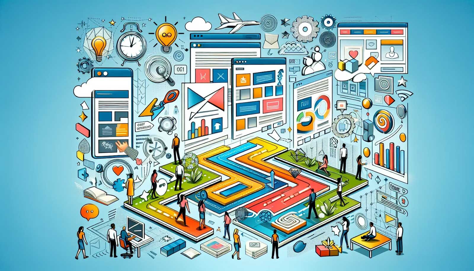
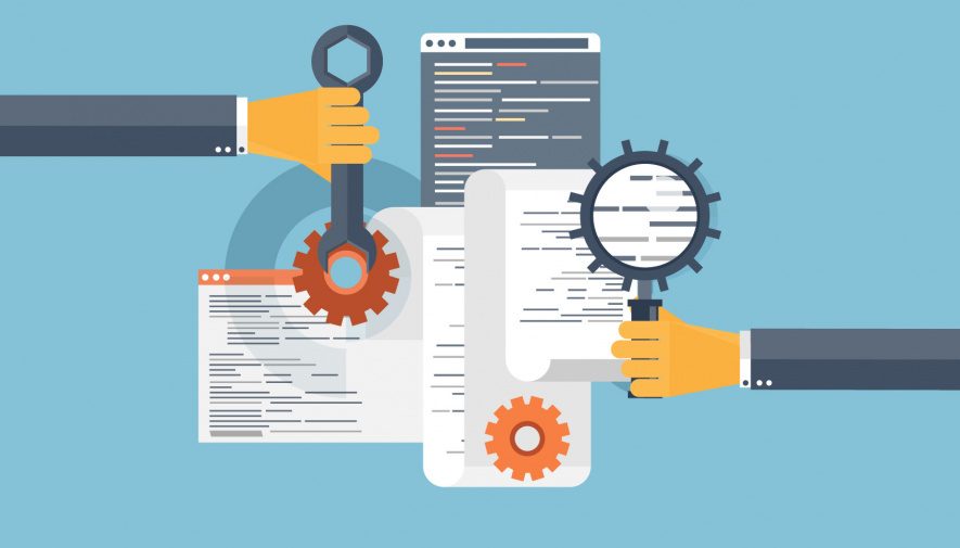
In today’s digital era, a professional website is essential for business success. Web Design Davao, a trusted agency in the Philippines, specializes in website planning and creative web designs that yield results. They prioritize seamless user experiences, combining aesthetics with functionality. Their expert team offers responsive designs, e-commerce development, and more. Beyond...